The iOS system, now in its second decade, seems to satisfy the majority of users but can still be frustrating for the more demanding among them, particularly those familiar with jailbreaking.
In a previous article, we highlighted a few flaws in the iOS interface that have persisted for years.
Here, we will take stock of the possibilities for gesture-based navigation between apps and system utilities, whilst suggesting potential improvements.
In this second instalment of our series ‘iOS: an interface with room for improvement’, you’re in for a treat with some of our tips on how to get round the limitations of iOS’s touch-based usability – the famous iD! tips that are the highlight of this blog’s articles!
iOS edge gestures
Let’s take a look at the current state of swipe gestures, designed by Apple to be performed from the edge of the screen, by comparing them to previous versions of iOS.
Swiping down from the top of the screen
On iOS and iPadOS, swiping down from the top opens the Notifications Centre on the left and the Control Centre on the right.
In older versions of iOS, there was a single area for alternately pulling down either the notifications panel or the widgets panel, thanks to the system remembering your last choice!
A horizontal swipe allowed you to switch between the two panels, just as you can today.
Please note:
- It is no longer possible to bring up the widget panel with a single gesture (nor is there a customisable shortcut to do so).
- Outside the Home screen, there is no longer any way, whilst using an app, to bring up the Spotlight search engine with a single gesture.
- In earlier versions of iOS, the Control Centre was opened by swiping up or down on the screen, which was much more convenient on the iPhone.
In iPadOS, recent updates to ‘Stage Manager’ and ‘Multi-Window’ mode mean you can now use three swipe gestures at the top of the screen!
Swiping down from the top of the screen to the centre can bring up a menu bar for the current app:
< Multitasking and gestures/Swipe to display the menu bar >
From iOS 27 onwards, three upper swipe areas could be implemented, incorporating new direct access to Siri via a central gesture.
Swipe in from the sides of the screen
These gestures apply to navigation within most apps, on the lock screen or home screen, as well as for the app switcher and top panels.
The principle has remained unchanged since the first iOS and will likely remain set in stone for the foreseeable future.
Note: on iPadOS, with ‘Stage Manager’ or ‘Multi-Window’ mode, traditional edge-to-edge navigation gestures often conflict with window resizing.
Swipe up from the bottom of the screen
Here, Apple has subtly refined the gestures since the very first version of iOS, although there remains an inexplicable difference with iPadOS.
- A sharp swipe allows you to exit the current app or return to the first page of the Home screen.
- A short swipe brings up the Dock on iPadOS, but not on iOS!
- A long swipe brings up the app switcher (without the Dock on iOS but with it on iPadOS).
Note: there is nothing to prevent the Dock from appearing on iOS for a short swipe as there is sufficient space. It would even be extremely practical from an ergonomic point of view (see our article on app launchers in iOS).
On iPadOS, with ‘Stage Manager’ or ‘Multi-Window’ mode, the few actions that could previously be triggered from the bottom corners of the screen are disabled.
iD! to replace the top-of-screen gestures on iOS
Whilst there is no direct way to customise the edge gestures in iOS 26, there are several workarounds to avoid the top swipes, which are the most risky when holding your iPhone with one hand.
3 Alternative Solutions to Bring Up the Control and Notification Center on iPhone:
- Replace the two top-of-screen gestures with double-taps and triple-taps on the back of the iPhone:
In < Settings/Accessibility/Touch/Back Tap >, assign your favorite actions to “Double Tap”and “Triple Tap” - Move the screen display down so you can use the top swipe gestures more safely, in the middle of the iPhone:
< Settings/Accessibility/Touch/Easy Access > ✅ - Enabling “AssistiveTouch” allows you to add a virtual button that you can place anywhere on the screen.
You can then assign three actions to it: a single tap, a double tap and a long press to activate the actions you want:
< Settings/Accessibility/Touch/AssistiveTouch > ✅
then select the desired shortcuts for “Single Tap, Double Tap and Long Press”
iOS: room for improvement in touch-based usability
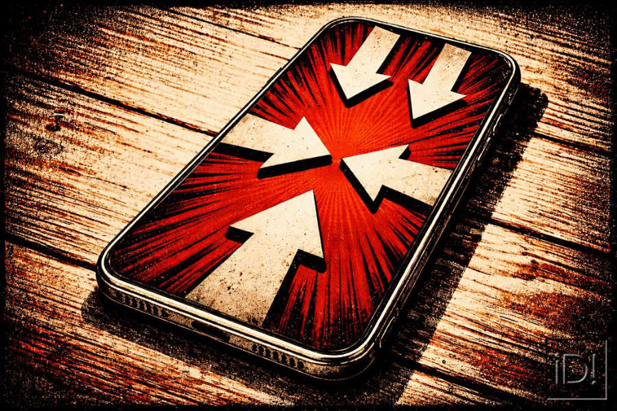
It seems obvious that, when holding an iPhone in one hand, gestures performed from the bottom of the screen are more convenient than those performed from the top.
Yet Apple, which came up with the idea of including two swipe areas at the top of the screen (and then three on the iPad in split-screen mode), did not do the same for the bottom.
Having jailbroken iOS for over ten years, we can assure you that splitting the swipe area into two or three sections at the top and bottom of the screen, and/or enabling actions from the corners, is perfectly ergonomic and functional.
The overlooked corners of iOS
Apple has included the ability to trigger actions from the two bottom corners on the iPad only. However, the available options are so limited (screenshot or quick note) that it’s frustrating not to be able to customise them.
To enable gestures from the bottom corners on the iPad:
< Settings/Multitasking & Gestures/Swipe from a Corner with Finger >.
To further improve touch ergonomics, we should be able to choose our favourite actions from the corners on both the iPhone and iPad to launch apps, shortcuts, etc.
Let’s campaign for customisable top and bottom bars!
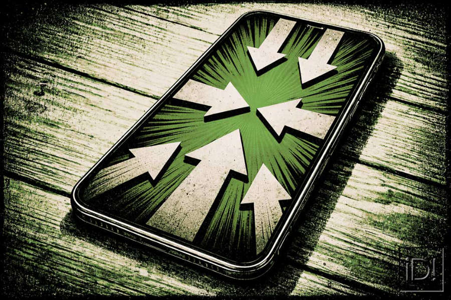
The ability to have at least three swipe areas at the bottom of the screen, just like at the top, would be extremely useful.
An iPhone with three areas at the bottom (left/centre/right) or a central area and two customisable active corners would allow you to open Universal Spotlight or Control Centre (as in the past), the notifications panel or the widgets panel (which currently has no direct shortcut), without compromising the central area dedicated to the app switcher and the return to the home screen.
We could then, if we wished, do away with the top-of-screen gestures entirely!