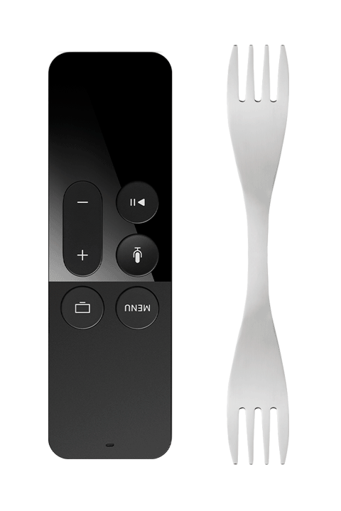
Do you often take a fork upside down?
Unless you are blind, you will mostly answer no, of course, because the object has a meaning and its form can not create any confusion in your mind.
Some designers are so much looking for the simplification of shapes that they create remotes with nonsens design and they seem to forget the everyday use that we have with this kind of objects.
My "accused" of the day is a touchscreen remote for the Apple TV create in 2015.
For my part, I have been invaded for years by remotes (11 currently, just in my living room).
With the use, I could thus compare different models and acquire by practice a certain expertise.
Why does this remote continue to annoy me for so many years?
With this type of object that one often takes without looking at it and that one uses in the evening in the dark, it seemed to me that there had always been a kind of convention in its conception, that is to say the willingness to create an ergonomic shape that fits in the hand or that includes, at least, a specific part provided to indicate the good sense of grip of the object.
In the absence of a successful ergonomics, the weight of the batteries placed universally in the lower part of the remote control generally encourages us to take it and hold it in the right direction.
What happens when designers decide to create an object like a remote control and get rid of giving it a meaning, an ergonomic shape or any other sensation for the user?
The answer is simple: statistically, we take it the wrong way once in two!
In 2015, ignoring decades of user experience, we have a company known worldwide for its design and manufacturing quality of its products that decides to re-invent the remote control in a rectangular shape with rounded corners and whose weight is distributed over the entire object.
With a minimum of centered buttons, two smooth symmetrical areas on both sides including a touch zone.
Nonsense design
 A nonsense fork reinvented to make a mark in an apple or our palm?
How to imagine that in a design studio as good, no one is noticeable during user tests that this remote is not at the minimum level that is expected for this type of object?
Because too often we take it upside down, click for nothing on a non-tactile area (or the opposite), or even trigger actions involuntarily!
![]() The epilogue: after two years, in 2017, the designers have tried to correct the situation by adding a slight white rim embossed on the upper button ...
The epilogue: after two years, in 2017, the designers have tried to correct the situation by adding a slight white rim embossed on the upper button ...
A statement of error but a small patch for humanity that ultimately has a small impact on the inadequacy of the use of this remote control in everyday life.
 Let's be fair: in my 16 remotes officially listed to date, I have two other perfectly rectangular models.
One comes from a fan manufacturer on which the buttons have been placed perfectly symmetrical, perhaps for the purpose of being unusable in the dark, on a hot summer night?
The other, designed by the French designer Philippe Starck is a rectangular "brick" rather successful that is weighted on one side with a heavier metal part and has on the edges of small recess for gripping without error and a very good held in hand. The upper part in soft touch has very raised areas and allow use in the dark without any problem.
Which proves that we really do not have much to make ergonomic a simple form ...